Ally Financial
UX Design| Design system| Accessibility
Revitalizing a legacy platform with modern, user-centered design for seamless financial management.

Overview
SmartCash, a financial platform initially designed in 2003, lacked user-centric design. The platform was content-heavy, with no clear information hierarchy, broken navigation (buttons leading to dead ends), and redundant pop-ups disrupting the user experience. These usability challenges highlighted the need for a complete redesign to modernize the platform and enhance its user-friendliness.
Duration
6 months
Tools
Figma, Gemini, Miro, Jira
Role
UX Designer
2
User Groups
4
Traunches
42
Userflows
426
Screens redesigned
1
Design system created
Agile UX
The SmartCash redesign was a fast-paced project completed within 6 months, requiring close collaboration, quick decision-making, and effective communication. The process followed principles of Agile UX, emphasizing iterative design, developer collaboration, and rapid validation. It involved analyzing business requirements, creating low-fidelity prototypes, conducting team and UX critiques, aligning with developers, and ensuring accessibility compliance. I also prepared and delivered presentations to stakeholders, effectively communicating the design rationale and securing approvals. Despite the tight timeline, every step was executed meticulously to deliver a user-centered, accessible, and technically sound design.


Challenges in older design
Before the redesign, the design language failed to deliver an intuitive and effective user experience. The outdated platform lacked modern UX principles, leading to a variety of usability challenges. Here are the key issues that were identified:

1 / Outdated design
No consideration for modern UX principles, leading to a dated and unintuitive interface.
2 / Overwhelming Content Density
Information was presented without clear prioritization, making it difficult for users to focus on important tasks.
3 / Ineffective Navigation
Broken links and buttons disrupted user flow and made it challenging to complete tasks.
4 / Unnecessary Pop-Ups
These were distracting and hindered the user’s ability to focus on important actions.
5 / Lack of Clear Information Architecture
Content and actions were not logically organized, confusing users and increasing cognitive load.
6 / Inconsistent Visual Design
Lack of design consistency across the platform led to a disjointed experience for users.
Design System
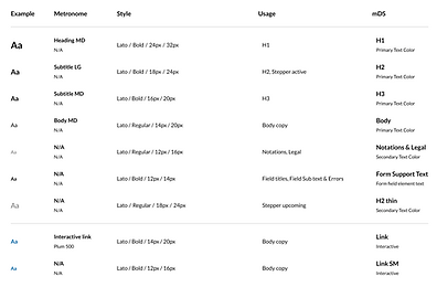
To address the platform's challenges, we revamped the design system, introducing modern components optimized for usability and scalability. The new components were more compact, allowing critical content to fit seamlessly on a single page without overwhelming the user. This update not only enhanced content prioritization but also ensured consistency across the platform. By adhering to accessibility standards and leveraging modular design, the system became adaptable for future updates, offering a cohesive, user-centric experience across all interfaces.


One significant challenge during the redesign was creating a table component that was both easy to use and highly customizable. Initially, the table was structured row-by-row, which made customization of individual cells cumbersome and inefficient. After recognizing this limitation, we shifted to a column-based approach, which streamlined the customization process and greatly improved efficiency. This change not only resolved the customization issues but also enhanced the overall usability and scalability of the table component within the updated design system.
Redesign
The final redesigned screens directly address the earlier challenges by prioritizing clarity, usability, and consistency:
-
Simplified Layout: Compact components streamline content presentation, reducing cognitive overload.
-
Enhanced Navigation: Logical flow and functional links improve task efficiency.
-
Task-Focused Design: Redundant pop-ups were removed, enabling seamless task completion.
-
Unified Visual Language: Consistent design elements create a cohesive experience.
-
Accessibility and Inclusivity: Designs meet accessibility standards, providing clear feedback and improving usability for all users.
These updates transform the user experience, offering an intuitive and efficient platform.


* Due to confidentiality, I’m unable to showcase certain complex workflows and screens from the redesign. However, the presented screens highlight key solutions and the overall design approach that resolved major usability challenges
Reflection
Through this redesign, I learned the value of adaptability and iterative design when addressing complex challenges. I deepened my understanding of creating scalable solutions through a modular design system and balancing user needs with technical feasibility. I also gained insights into streamlining workflows for customization, such as shifting from row-based to column-based table structures. Collaborating across teams emphasized the importance of clear communication, especially during fast-paced projects. Lastly, I reinforced the critical role of accessibility and user feedback in delivering impactful designs.